If you’re a beginner acrylic painter, understanding the colour wheel might seem like a big ask. It might even seem unnecessary – after all, if you like the painting you created, who cares if you used complementary colours or analogous colours?
I felt the same when I was starting out. But a basic understanding of colour theory can go a long way in helping you make decisions when you’re painting.
It can also help you figure out exactly what went wrong if something feels off. And better yet, using a colour wheel can stop you making mistakes in the first place.
Here are the contents of this article — click a heading to scroll straight to that section:
- What is the colour wheel?
- What are primary colours?
- What are secondary colours?
- What are tertiary colours?
- What are complementary colours?
- Examples of complementary colours
- What are split complementary colours?
- Examples of split complementary colours
- What are analogous colours?
- Examples of analogous colours
- What are warm and cool colours?
- How do you make a colour wheel?
Sign up for my monthly emails of creative tips, tutorials and DIYs and get 31 free creative prompts!

You can unsubscribe at any time
What is the colour wheel?
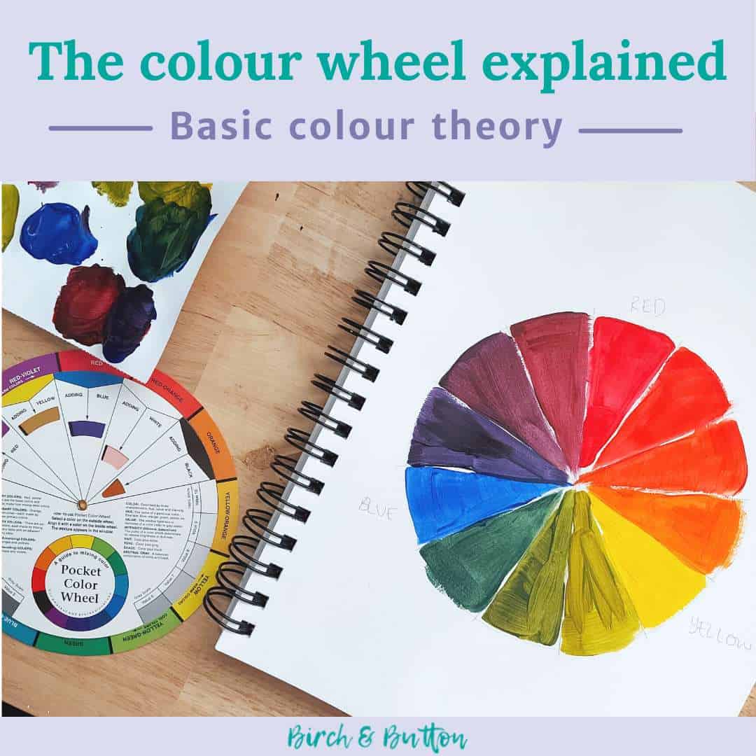
The colour wheel is a circular tool used in art and design. It shows the relationships between the primary colour hues of red, blue and yellow and the secondary and tertiary colours.
It can also help you choose a colour palette when you’re painting, or pick the correct colour to convey a certain mood.

What are primary colours?
The primary colours on the colour wheel are red, blue and yellow.
You can mix most other colours using these three. But it’s worth bearing in mind that there are different types of red, blue and yellow, with different undertones.
As an example, ultramarine blue has a slight red tone, and you can get phthalo blue in a green shade and a red shade. It’s worth thinking about what you want to use the blue for to make sure you get the right one.
For example if you want a blue that you can use to paint the sea, or maybe use to mix the greens of various plants, you’ll want to choose one in a green shade.
If you mix a green using a blue with a red undertone, it’ll turn out muddy rather than bright and vibrant. This is because if you add even a tiny amount of red to a mixture of blue and yellow, it’ll start heading towards brown.
What are secondary colours?
The secondary colours on the colour wheel are green, orange and purple.
Secondary colours are made by mixing primary colours:
- Green = yellow + blue
- Orange = yellow + red
- Purple = red + blue
As mentioned above, you should bear in mind that the different versions of the primary colours will mix to create slightly different secondary colours.
What are tertiary colours?
The tertiary colours on the colour wheel are yellow-orange, red-orange, red-purple, blue-purple, blue-green and yellow-green.
As you can probably tell, tertiary colours are made by mixing a primary and a secondary colour:
- Yellow-orange (otherwise known as amber) = yellow + orange
- Red-orange (or vermilion) = red + orange
- Red-purple (or magenta) = red + purple
- Blue-purple (or violet) = blue + purple
- Blue-green (or turquoise/teal) = blue + green
- Yellow-green (or chartreuse/spring green) = yellow + green
What are complementary colours?
Complementary colours are those that are opposite each other on the colour wheel. They’re sometimes also known as opposite colours or contrasting colours.
They look especially vivid when placed next to each other, although some people feel they clash.
If you mix complementary colours together, you tend to get a muddy colour. This is because you’re effectively mixing all three primary colours, which together produce brown.
So if you’re working with complementary colours in your artwork, be sure to let them dry well. That way they won’t accidentally mix and undo all your hard work of choosing colours that pop next to each other!
Examples of complementary colours
Examples of pairs of complementary colours include:
- Red and green
- Orange and blue
- Yellow and purple
Pick a colour on the colour wheel and look at what’s directly opposite it. That’s its complementary.

What are split complementary colours?
Split complementary colours are those that are either side of a complementary colour.
To identify split complementary colours, choose your colour on the wheel and look at the opposite side to find its complementary colour. Either side of the complementary colour are the split complementary colours.
Using split complementary colours helps bring some variety and contrast into your artwork without running the risk of using colours that are just too different or jarring.
Examples of split complementary colours
Here are some examples of split complementary colours:
- For blue = red-orange and yellow-orange
- For green = red-purple and red-orange
- For yellow-orange = blue and purple
What are analogous colours?
Analogous colours are those that are next to each other on the colour wheel. They’re sometimes also known as harmonious colours as they work well together in a painting.
An analogous colour palette feels like it works nicely. A painting featuring analogous colours looks and feels ‘right’, and there won’t be any jarring or high contrast areas.
Examples of analogous colours
Examples of analogous colours include:
- Green, blue-green and blue
- Red-orange, orange, yellow-orange and yellow
- Blue-purple, purple, red-purple, red and red-orange
Analogous colours are usually used in sets of between three and five. Any more than this will result in using a pair of complementary colours, which are high contrast and not harmonious.
What are warm and cool colours?
The colour wheel can also be divided into six warm colours and six cool colours.
The terms warm and cool simply refer to the feeling you get when you look at them. Do they remind you of things associated with heat or things associated with cold?
Warm colours often feel energetic, stimulating and are associated with happiness, like:
- Red-purple
- Red
- Red-orange
- Orange
- Yellow-orange
- Yellow
Cool colours tend to be more relaxing and sometimes linked with sadness, such as:
- Purple
- Blue-purple
- Blue
- Blue-green
- Green
- Yellow-green
I’m a big fan of cool colours (just take a look at my blog design, graphics and my artwork if you need confirmation!)
How do you make a colour wheel?
You can buy ready-made colour wheels but it’s a good idea to have a go at making your own. This is because it really helps you to understand the relationship between the colours and get a good feel for how to mix various colours.
I’ve made a video to walk you through the process of making your own colour wheel:
To follow along with this tutorial you’ll need red, yellow and blue paint, plus something to paint on! I used cadmium red, cadmium yellow, ultramarine (I’ve linked to some of my favourites) and my Canson XL Mixed Media pad.
For explanations of more acrylic painting terms, check out this article: Acrylic Painting Terms: A Glossary For Beginners.
About Stacey

I’m Stacey and I’m a blogger, abstract artist and freelance writer. My aim is to help busy people feel inspired and get more creative with tutorials, hints and tips.
I live in Cardiff with my partner and dog, and in my free time you’ll find me hiking, reading, painting or sampling a craft beer or two.

